Now that you wet your toes, we are ready to start swimming lessons… Let’s jump right in. We will now begin to give you the basic tools necessary to be a successful Forex trader.
- Charts Types
- Supply and Demand
- Lines & Trends
- Time Frames
- Trading Styles: long, short, day, intraday, swing, scalping
- Multiple Time Frames Strategy
- Types of Analysts
We strongly advise that you go into the demo account you opened and start practicing the lessons you will learn here. After each subject, you should go to your demo account and practice the new techniques that you just learned. Additionally, you will find exercises to practice with at the end of each lesson.
Types of Charts for Forex Trading
The data regarding pairs’ rates is presented on forex trading charts. We use these charts to study and analyze the trends and movements of currencies at any given moment. Every platform offers you a variety of types of charts. Each chart has advantages and disadvantages and is best for specific targets. At the end of the day, a trader chooses to work with the particular chart that best answers his needs. There is no right answer here; it depends on the trader’s character and targets. Let’s have a look at the most familiar charts:
- Line chart – Like its name, it is a continuous, line-shaped diagram of the currency pairs’ price movement over a chosen period of time. The line connects the closing price of the one-time range to the opening price of the next time range, forming a line. The advantage of line charts is that they help to build a clear picture of price movements and trends through time. They also allow you to recognize trends.
Example of a line chart: 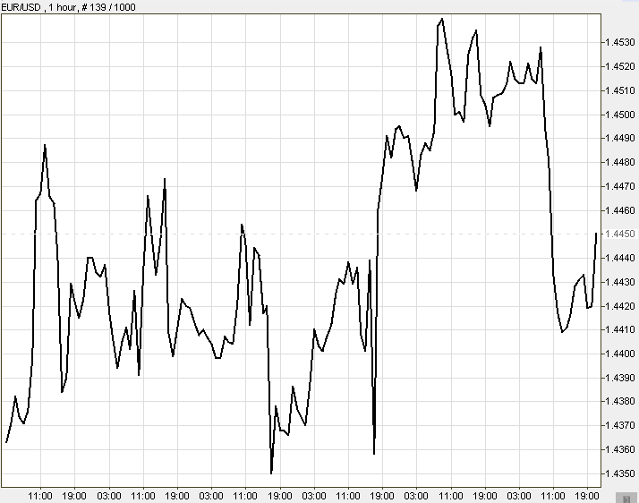
- Bar Chart –A group of poles connecting the pair’s highest price to its lowest price within a specific time range. It also shows the chosen time range’s opening and closing price.
A single bar chart: 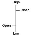
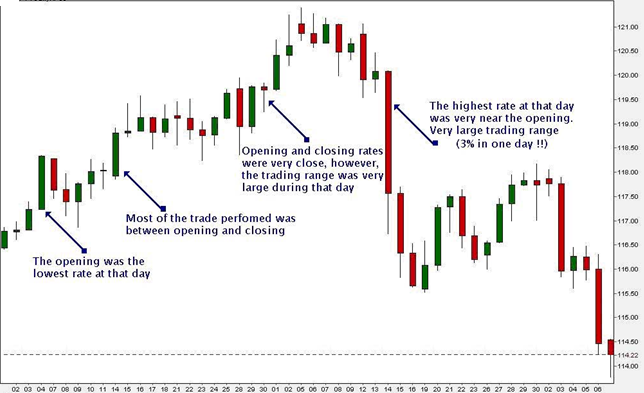
- Candlestick Chart – The Japanese Candlestick Chart system has gained massive popularity since the end of the last century. Today, it is the most popular way to look at charts. This chart contains a group of “candles.” Each candle is a body stretched from the opening price to the closing price within the particular time range of the candle. It looks a bit like the bar chart, but in our opinion, it is much more visually intuitive.
Each candle has four elements, as shown in the picture below: Opening, Closing, High and Low. The candle’s body is colored either red or green. Color represents the price direction at that time zone. Green (or white) candles show that prices rose. Red (or black) shows that prices fell. Long sticks indicate intense activity (buying or selling), while short sticks suggest limited trading activity in the time range of that candle. Lines above and below the body are called Shadows. Long shadows indicate a lot of action between the opening price and the tip of the shadow – or between the closing price and the tip of the shadow of the time range represented by the candle. Briefer’s shadows indicate that most activity occurred around the opening and closing price. Example of Japanese Candlesticks: 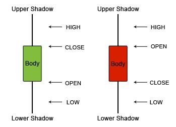 Tip: We love working with Candlestick charts and recommend that you use them as your primary charts. Their structure and colors are very helpful for less experienced traders. Also, it is very easy to use them for trend analyses. Many forex analyses are based on the candlestick forex trading strategies. Let’s look at some of the most common types of sticks you will meet on the platform. This is a spinning top Japanese Candlestick formation:
 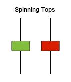 Short candles and similarly sized shadows both above and below indicate that there is no decision between buying and selling forces on this pair at a particular time. A spinning top’s appearance after a trend can imply a change in the direction of the trend. This is a Marabuzo Japanese Candlestick formation:
  The green candle indicates a “bully trend” (buyers trend), and the red candle is a “bearish trend” (sellers trend). The appearance of a Marabuzo implies an upcoming reversal in the trend direction. The bearish candle, bigger than the previous candle, shows that the trend has reached a level where the sellers outnumber the buyers. This is how the Marabuzo Candlestick formation may appear on charts:
 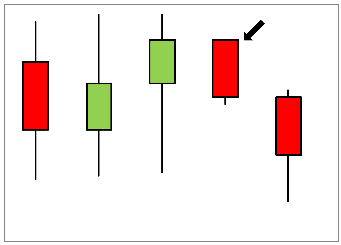 This is a Doji candlestick formation:
 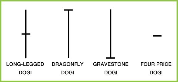 A Doji candlestick formation may form when there is no decisiveness in the struggle between buyers and sellers. Note that the dragonfly doji (or the gravestone doji) is usually referred to in forex as a pin and upside-down pin, respectively. Tip: When a Doji appears right after a Marabuzo, it implies with high probability an upcoming trend reversal! This is how a Doji might appear on a chart:
 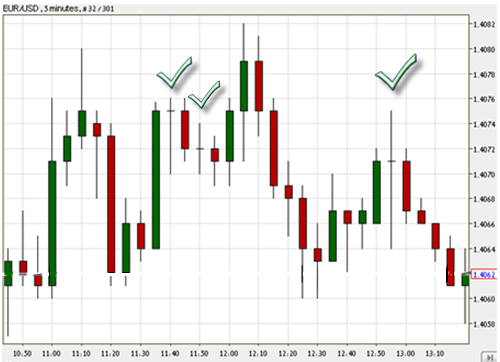 Single Stick Candlestick Formation:
 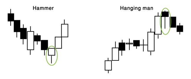 Hammer – Usually followed by a bullish trend (uptrend) after a downtrend. This is an indicator of a reversal. The lower indicates that the sellers were still trying to keep up with the bearish trend, but the buyers were stronger and brought about a change in direction. Although it indicates a reversal, you shouldn’t rely solely on this single hammer. Tip: Wait for the next candlestick to decide that a reversal is taking place. Identifying marks include a long lower shadow and a disappearing upper shadow. Hanging Man – The opposite of a Hammer. It can be a peak, which signals an uptrend’s end and a downtrend’s start. It is an indicator that the market is moving in a sell direction. Inverted Hammer and Shooting Star examples:
 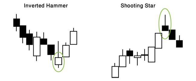 The shadow of an Inverted Hammer indicates that buyers wish to reverse the trend direction into an uptrend; however, sellers are giving them a hard time; nevertheless, if the stick is white (green), buyers are beating sellers. The pattern indicates a reversal from selling into buying! Shooting Star works the same, only in the opposite direction – indicating a downtrend. Two candles Tweezer Bottom and Tweezer Tops examples:
 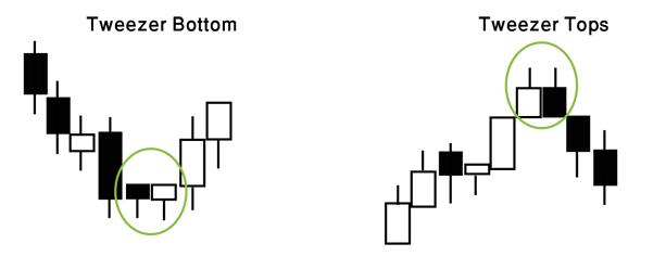 We recognize tweezers when the first candlestick of the two follows a trend and the second candlestick is a reversal, usually, they are equal in size, and their shadows are more or less the same lengths. Triple Candles Soldiers and crows: first comes the shortest of all three. This chart pattern points to a clear change in the trend’s direction. In this situation, the level of certainty is high (there is a perfect chance for a reversal trend!). Notice that the third candlestick shows a tiny shadow (or none at all). Three White Soldiers and Three Black Crows example:
 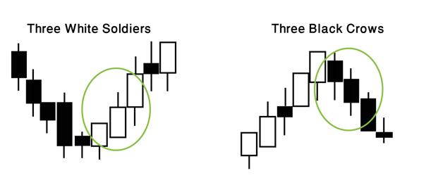 Three Inside Up/Down: Again, both show the same form. The first candle is relatively long and goes with the direction of the trend; the second is approximately half of the length of the first, and the third closes longer than the tip of the first candle and in the opposite direction of the trend.
Three Inside Up and Three Inside Down examples: 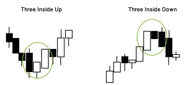 Morning/Evening Stars usually appear at the end of a trend, signaling its end. Morning Star and Evening Star examples:
 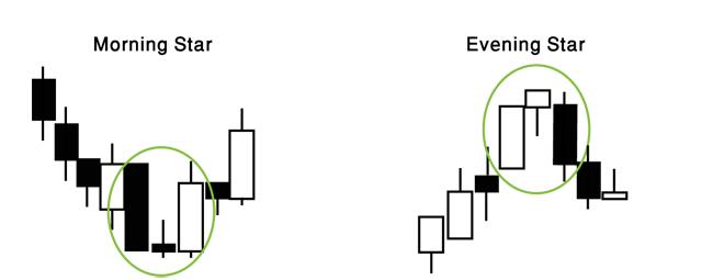 This is what it looks like on a candlestick chart: