Moving Averages
Prices shift many times during each session. A standard trend can be unexpected, volatile and full of changes. Moving averages are intended to put order into prices. A moving average is the average of pair’s closing prices over a period of timeframes (a single bar or candle can represent different timeframes, for example- 5 minutes, 1 hour, 4 hours, and so on. But you already know that…). Traders can choose the timeframe and the number of candlesticks they want to examine using this tool. Averages are fantastic for getting a sense of the general direction of market price, analyzing a pair’s behavior and predicting future trends, especially when using another indicator at the same time. The smoother an average price (without significant ups and downs), the slower its reaction to market changes will be. There are two main types of moving averages:
- Simple Moving Average (SMA): By connecting all closing points you get the SMA. This calculates the average price of all closing points within a chosen timeframe. Due to its nature, it indicates a near future trend by reacting a little late (because it is an average, and that is how an average behaves).
The problem is that radical, one-time events that took place within the tested timeframe have a major impact on SMA (in general, radical numbers have a larger impact on an average than moderate numbers), which might give the wrong impression of an incorrect trend. Example: Three SMA lines are presented in the chart below. Each candle represents 60 minutes. The blue SMA is an average of 5 consecutive closing prices (go 5 bars back and calculate their closing price averages). The pink SMA is an average of 30 consecutive prices, and the yellow is an average of 60 consecutive closing prices. You will notice a very logical tendency in the chart: as the number of candlesticks increases, the SMA becomes smoother, while it responds more slowly to market changes (more distant from the real-time price. 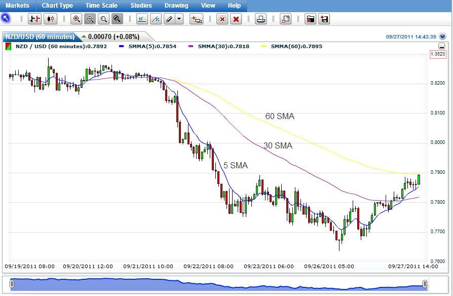 When an SMA line cuts a Price line, we can predict with relatively high probability a coming change in the trend’s direction. When the price cuts the average from below upwards, we are getting a buying signal, and vice versa. An example of moving average of a forex chart:
  Let’s take a look at another example: Pay attention to the cutting points of the price line and SMA line, and especially to what happens to the trend right afterwards.
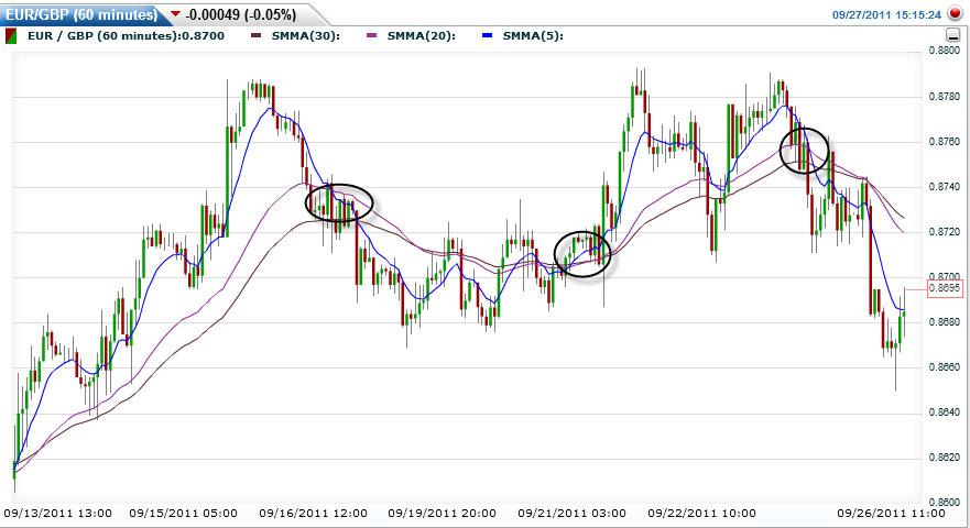
 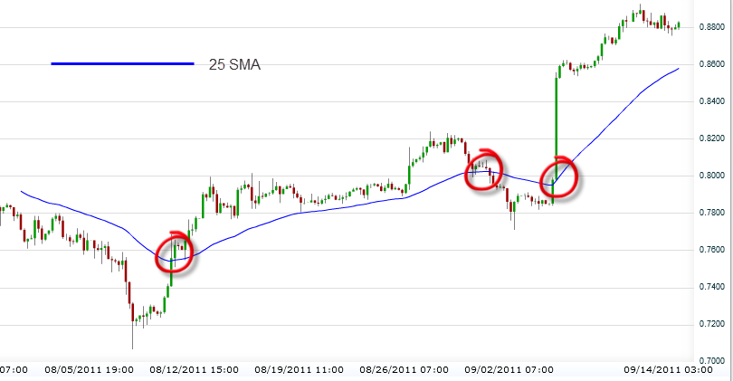 Tip: The best way to use this SMA is to combine two or three SMA lines. By following their cutting points you can determine expected future trends. It increases our confidence in shifting the trend direction – as all the moving averages are broken, like in the following chart:
- Exponential Moving Averages (EMA): Similar to SMA, except for one thing – The Exponential Moving Average gives greater weight to the last timeframes, or in other words, to the closest candlesticks to the current time. If you look at the next chart, you will be able to notice the gaps created between the EMA, SMA and the price:
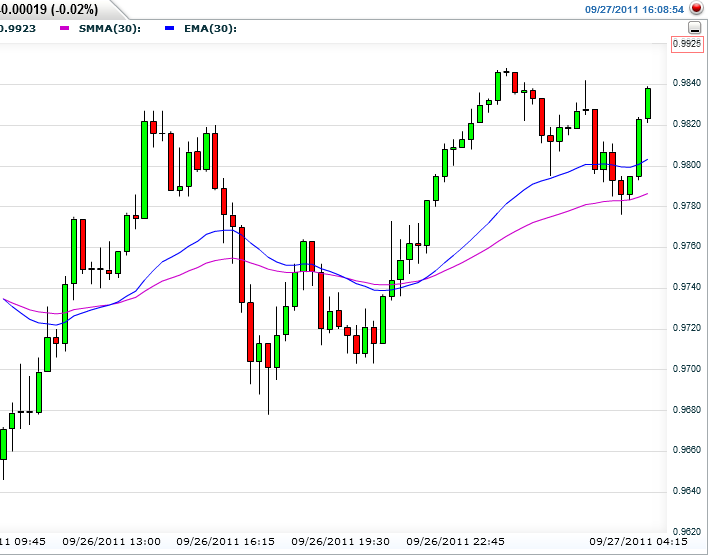 Remember: While EMA is more effective in the short term (responds quickly to the price’s behavior and helps to spot a trend early on), SMA is more effective in the longer term. It is less sensitive. On the one hand it is more solid, and on the other hand it responds more slowly. In conclusion:
| SMA | EMA | |
| PROS | Disregards most Fakeouts by displaying smooth charts | Quickly responds to the market. More alert to price shifts |
| CONS | Slow reactions. May cause late selling and buying signals | More exposed to Fakeouts. Can cause misleading signals |
If the price line stays above the moving average line – the trend is an uptrend, and vice versa. Important: Pay attention! This method does not work every single time! When the trend reverses, you are advised to wait for 2-3 candlesticks (or bars) to appear after the current cutting point, in order to be sure that reversal has been completed! It is always recommended to set a Stop Loss strategy (which you are about to study in the next lesson) to prevent unwelcome surprises. Example: Notice the excellent usage of EMA as a resistance level in the next chart (SMA can also be used as a support/resistance level, but we prefer using EMA): 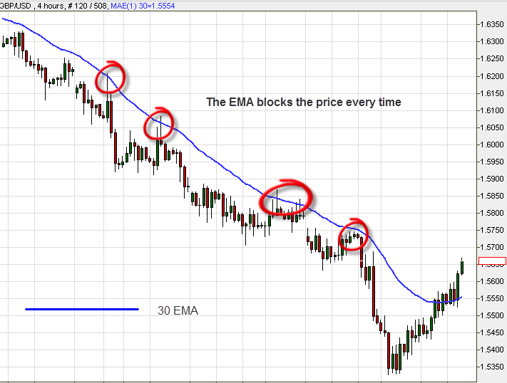 Now, let’s examine the usage of two EMA lines (two timeframes) as support levels:
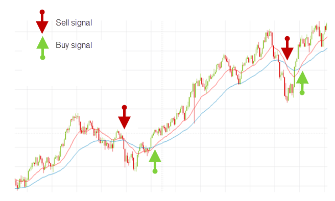
 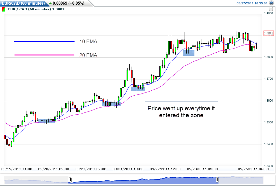 When candles hit the inner zone between the two lines and turn back – that’s where we will execute a Buy/Sell order! In that case – Buy. One more example: The red line is a 20′ SMA. The blue line is a 50′ SMA. Pay attention to what happens each time there is an intersection – the price moves in the same direction as the red line (shorter term!):
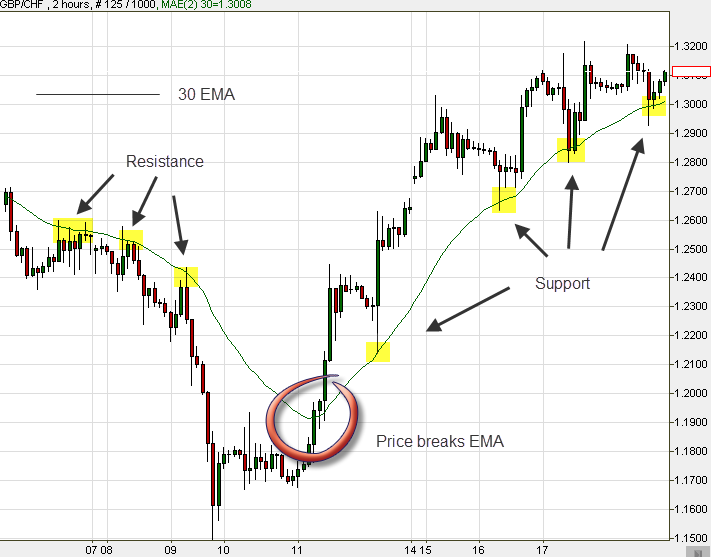
  Important: Averages can be breached, exactly like support and resistance levels:
  To sum up, SMA and EMA are fantastic indicators. We strongly recommend you practice them well and use them when actually trading.